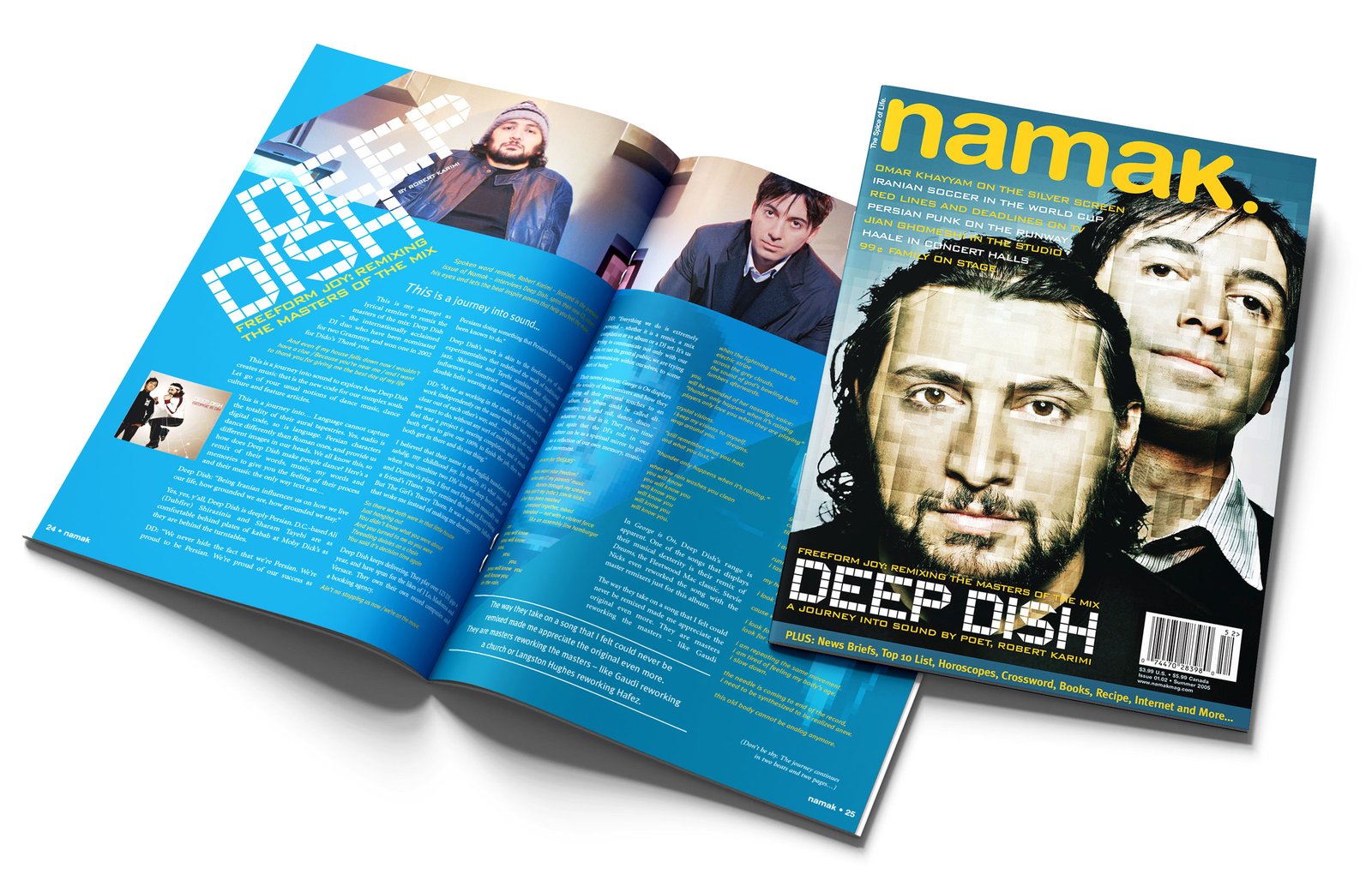
Namak Magazine broke new ground as the first high-gloss, full-color lifestyle publication designed for young Iranian Americans. With bold editorial design and uncompromising print quality, it challenged long-held expectations of what Iranian diaspora media could be.
Publisher, Art Director, Editor
I designed every page for each issue, including covers, editorial layouts, and ads.
Namak was a passion project with a professional finish—but almost no budget. The goal was to rival mainstream magazines in quality and cultural relevance, without access to original photo shoots or a steady stream of premium content. Most existing Iranian publications at the time were low-cost, ad-driven tabloids, lacking cohesive design or editorial integrity. Namak had to change the game—on a shoestring.
We focused every dollar on exceptional print and distribution, then got creative with everything else. Without a photography budget, we relied on images provided by interviewees, repurposed stock creatively, and developed original graphics from scratch. The design walked a fine line: modern and edgy without relying on tired cultural tropes. Every layout, headline, and color choice aimed to connect with an audience raised between two worlds—one that had never seen itself reflected quite like this before.
Namak set a new standard for community publications. Its legacy lives on in the full-color, high-quality magazines that followed—many of which adopted our vision, production process, and even our print vendors.