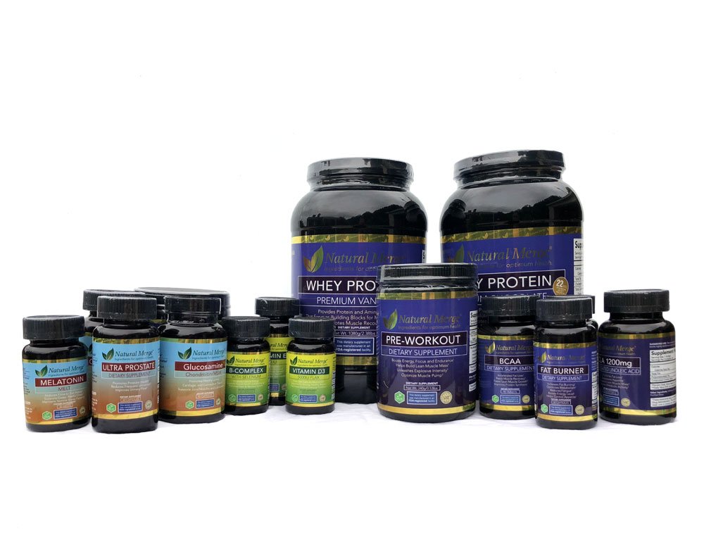
Clean, shelf-ready packaging for a new line of health supplements, tailored to both online and retail sales. Each product needed a cohesive identity under the parent brand, while remaining visually distinct for quick consumer recognition.
Creative direction, package design, product hierarchy, brand alignment.
To design a family of supplements that felt trustworthy, modern, and easily distinguishable from one another — all while working within tight print and compliance constraints.
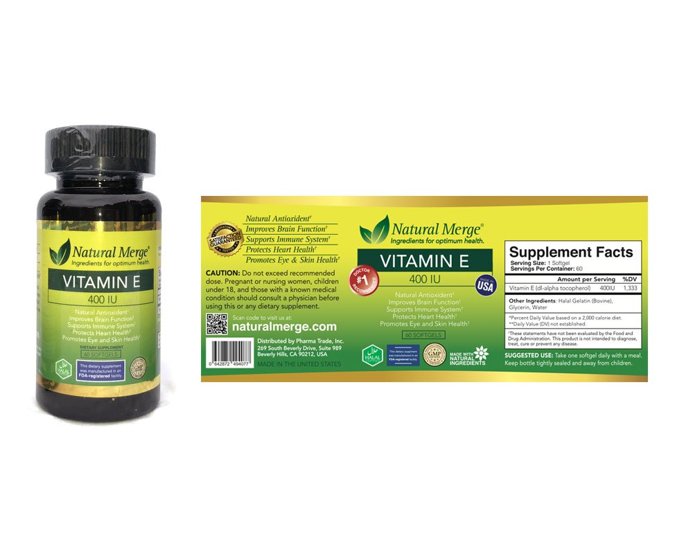
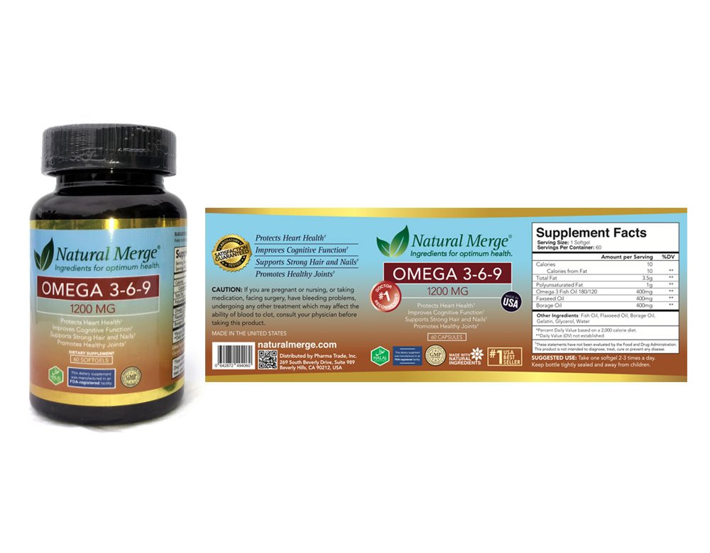
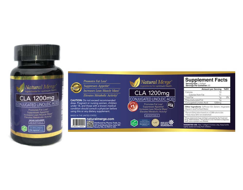
Created a unified grid system with prominent product names, clear benefits, and a color-coded identity for each supplement. The design balances FDA requirements with appealing minimalism, ensuring clarity in cluttered marketplaces.
The line successfully launched in multiple retail outlets and online platforms. The packaging design helped Natural Made establish a polished brand presence in a saturated market, improving first-time buyer confidence and supporting reorders through visual consistency.