Farhang Foundation’s USC Iranian Studies Initiative (ISI) represents a landmark partnership between community donors and the University of Southern California. Every few years, the Foundation publishes a high-impact progress report to document ISI’s accomplishments and momentum. I was commissioned to design data-driven visuals that could convey complex academic and institutional milestones in a compelling and accessible way.
These graphics were featured in multiple print publications targeting donors, stakeholders, and university leadership — designed to balance clarity with elegance and support long-form editorial layouts without overwhelming them.
Each report needed to illustrate student growth, program evolution, and key historical milestones — all in a format digestible to both academic and non-academic audiences. The raw data often came in piecemeal or inconsistent formats, and there was no prior visual language or infographic precedent to build on.
Each report needed to illustrate student growth, program evolution, and key historical milestones — all in a format digestible to both academic and non-academic audiences. The raw data often came in piecemeal or inconsistent formats, and there was no prior visual language or infographic precedent to build on.
I created a suite of infographics tailored to editorial storytelling:
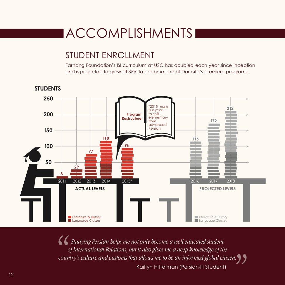
- Bar charts that visualized student enrollment over time, annotated with key structural changes in the curriculum.
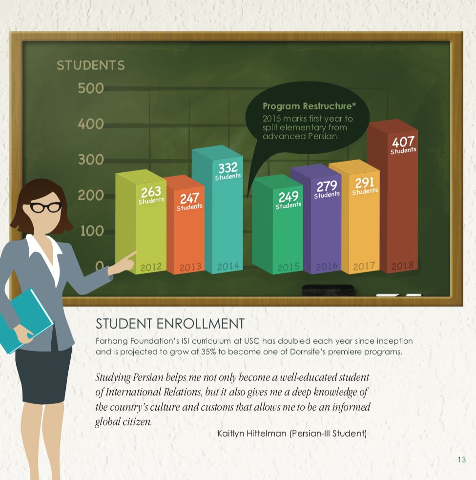
- A stylized chalkboard concept for a later report to reflect the program’s educational legacy in a more narrative-friendly, illustrated format.
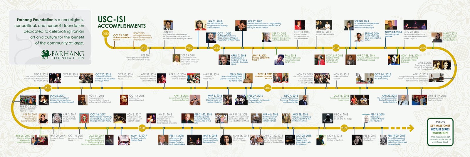
- A milestone timeline, inspired by transit maps, that condensed nearly a decade of lectures, events, and institutional achievements into a single horizontal graphic.
Each design was built from scratch to match the publication’s tone and branding, ensuring visual consistency while elevating the content’s strategic message.
The infographic series gave donors a clear, compelling view of the initiative’s scope and success. By visualizing how contributions directly supported faculty, research, and student engagement, the designs helped strengthen donor trust and inspired increased giving.