Work
Real problems.
Real constraints.
Systems that had to work.
These aren't hypotheticals. Each one was a situation where the stakes were real, the timeline was tight, and the people involved needed something that actually worked.
HomeExtras, Inc.
50 Hours of Stress.
20 Minutes of Work.
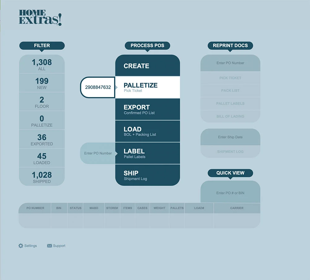
A small company imported linens from China and sold them to Walmart. The supply chain worked. The product was good. But one of the owners was spending 50+ hours every week on a process that should have taken an hour.
Every Walmart EDI order had to be downloaded manually, cross-checked against inventory, translated into pull orders for the warehouse, configured into pallet arrangements by weight and volume, labeled, documented, and tracked through to invoicing. The whole thing ran through a tangle of Excel spreadsheets, Word documents, and email chains. One missed step meant a delayed shipment. One error in a pallet calculation meant a rejected load.
The owner wasn't running his business. He was doing data entry.
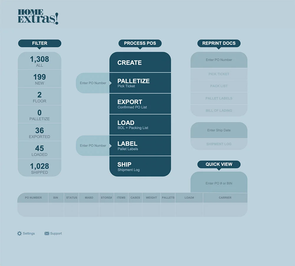
I built a custom FileMaker system that automated every step from order intake to delivery confirmation. The interface was designed the way a good tool should be — so obvious you don't need a manual. Import the EDI file. The system checks inventory, calculates pallets, generates labels and packing slips, alerts the warehouse, schedules shipping, and queues the invoice.
What took 50 hours now takes 20 minutes.
His wife called to thank me. She said she finally had her husband back.
That's the metric that mattered.
Need a system like this?
Let's TalkEpic Times Nightlife App
The Sign-Up Wall
Nobody Wanted
A nightlife and events discovery app was struggling to convert during beta. The engineers had built a perfectly functional product. The problem was the first thing it asked you to do — create an account before you could see a single event, club, or piece of content.
Users didn't trust an app they'd never used enough to hand over their information. They wanted to look first. The app was demanding commitment first.
But the sign-up wall was a symptom, not the disease. Deeper in the experience, forms collected data that wasn't needed yet. Icons borrowed from generic emoji sets felt cheap for a product targeting a style-conscious audience. Microcopy written by engineers said things no actual person would say.
The fix wasn't cosmetic. It was architectural.
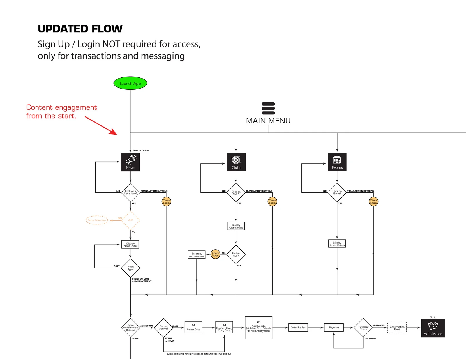
I flipped the funnel. Launch the app, hit content immediately — events, clubs, news, all of it browsable without an account. Login only appears when you try to do something that requires it: buy a ticket, send a message, leave a review. The wall moves from the entrance to the transaction — where it belongs.
Progressive data capture replaced the front-loaded form. Age only when adult ticketing requires it. Payment only at checkout. Every field earned its place by being needed right then, not just collected in advance.
The result: beta testers stayed longer, explored more, and came back. Not because we pushed harder. Because we got out of their way.
The internal shift mattered as much as the metrics. The product team stopped asking "how do we capture leads?" and started asking "how do we earn trust?" That question produces better products.
Need a UX audit or product flow redesign?
Let's Talk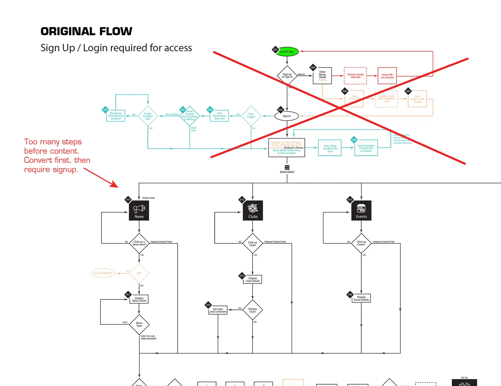
Alcohol E-Commerce
When Every Order
Could Be a Liability
An alcohol e-commerce company was operating in one of the most legally complex retail environments in the country. Alcohol shipping laws don't just vary by state — they vary by county, by city, by product category, by volume, by month. A shipment that's legal on Tuesday can be illegal on Wednesday if an annual limit resets.
Every order was a potential compliance violation. The team was making judgment calls on questions that shouldn't require judgment. They needed a system that knew the rules so they didn't have to memorize them.
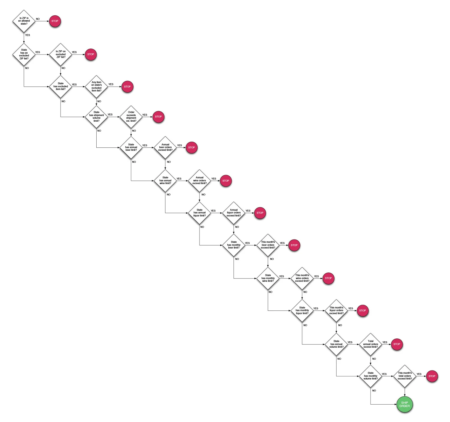
I mapped every decision point across the full compliance landscape — state allowances, ZIP exclusions, product category restrictions, annual volume caps, monthly limits — and built a binary logic tree that evaluated each order in real time. Every node was a yes or no question. Follow the path and you either reach SHIP ORDER or STOP. No gray area. No guesswork. No liability.
The tree was designed to be read by a human, not just executed by a machine. Anyone on the team could follow the logic, understand why a decision was made, and explain it if asked. Transparency was built in.
The system was adopted immediately. Not because it was mandated — because it removed a burden people had been carrying every day and replaced it with something they could trust.
Need compliance logic or decision architecture?
Let's TalkUCLA Oncology
Six Audiences.
One Website.
No Confusion.
UCLA Oncology needed a new website. That's the simple version. The real problem was harder: one site, six completely different audiences, and six internal teams — each with their own priorities, their own stakeholders, and their own strong opinions about what should be most visible.
Patients looking for treatment options are not in the same headspace as researchers looking for clinical trial data. Family members trying to understand a diagnosis need different language than referring physicians coordinating a transfer. Building one navigation system that works for all of them without alienating any of them is an information architecture problem — but getting six teams to agree on it is a diplomacy problem.
I mapped the full site before anything was designed or built. Forty-plus pages, organized by audience type, color-coded so the logic was visible at a glance. Every section had a clear owner. Shared content was identified and structured to serve multiple groups without being diluted for any of them.
The diagram became the alignment tool. Developers, clinicians, administrators, and executives could all look at the same image and understand the structure without needing it explained. When everyone can see the same map, the arguments get smaller and the decisions get easier.
The architecture got approved. The site launched. That's what the diagram was really for.
Need information architecture or content structure?
Let's Talk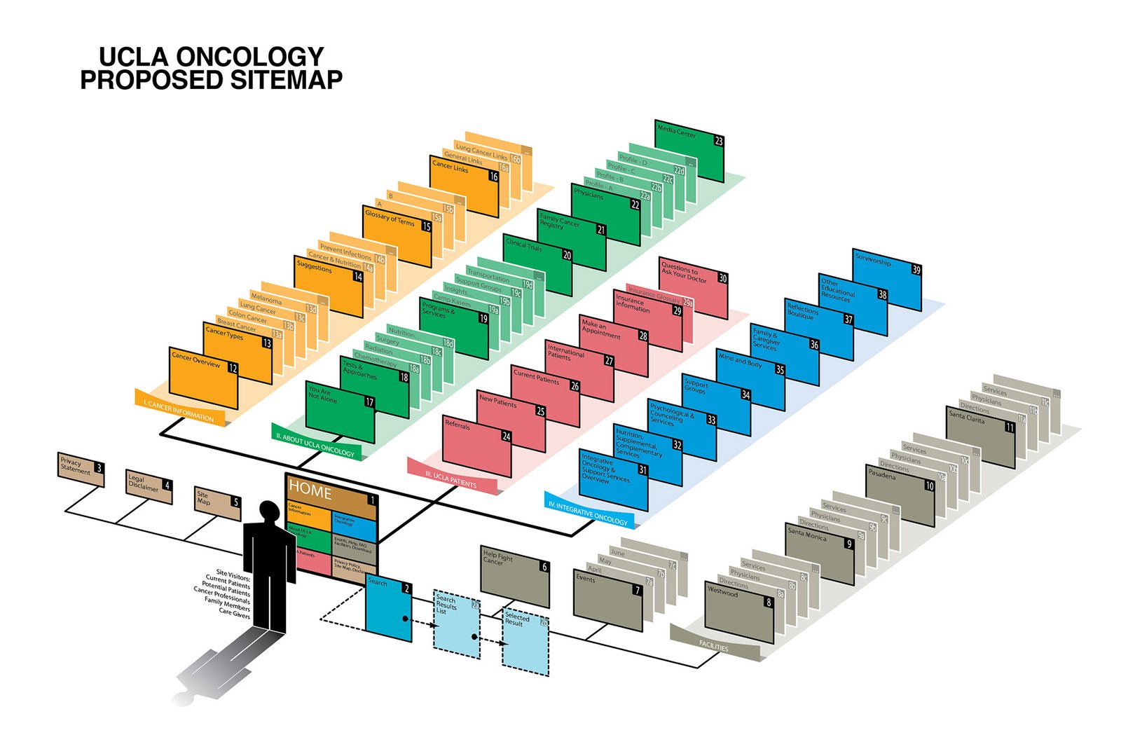


Nationwide Advertising Services
A Year-Long Transformation.
$1M in Annual Savings.
Nationwide Advertising Services was a high-volume ad agency with offices on both coasts. Their creative department was underperforming in every measurable way: inconsistent quality, missed deadlines, low morale, no standards, no growth path for staff, and no visibility into what was actually happening on the production floor.
They didn't need a new hire. They needed a new operating model.
I came in as a consultant and spent a year rebuilding the department from the inside. It started with a full assessment — skills inventory, workflow mapping, workload analysis, gap identification. The problems weren't mysterious once you looked at the data. Work was being assigned without regard for skill level. There was no onboarding system, so every new hire learned differently and inconsistently. QA happened at the end of the process, too late to catch anything cheaply. And there was no path for advancement, so good people had no reason to stay.
The redesign addressed all of it. Tiered skill levels tied to real production requirements. A training system built on the same logic used at AdOut — data-driven, on-the-job, tied to measurable improvement. Performance tracking that made advancement merit-based and transparent. A QA system that caught problems early rather than expensively. Workflow logic diagrams that made the process visible to everyone, not just the people running it.
By the end of the engagement, deadlines were being met consistently, creative quality was measurably up, and the department was saving the company nearly $1M annually.
The CEO brought me in again at his next company. That's the only review that matters.
Need a creative department transformation?
Let's TalkEvery one of these started with a conversation.
I build creative teams who love how they work.